Graphic Design
-Introduction to visual techniques
in advertising
-technical principles
-logos & image
-typography
-motion graphics
-print design
-web design
TYPOGRAPHY
History
•The design of type began with early cuneiform images carved into stone or painted on cave walls.
• The tradition expanded into blackletter calligraphy in the middle ages, then flourished in the industrial age with the development of Roman (serif) and then Gothic (san serif) letterforms.
The German inventor and printer Johann Gutenberg (ca. 1398-1468) was the inventor of movable-type mechanical printing in Europe (1450).
Gutenberg used hand-set type cast in molds to print multiple copies of manuscripts. Whereas scribes copied manuscripts by hand before Gutenberg’s invention, copying became mechanized and much faster after the invention. The invention of movable-type printing facilitated an easier exchange of ideas throughout Europe and helped spread the ideas of the Renaissance.
• Now, with the advent of PCs, anyone can create a typeface; there are literally thousands available.
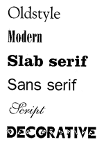
Styles
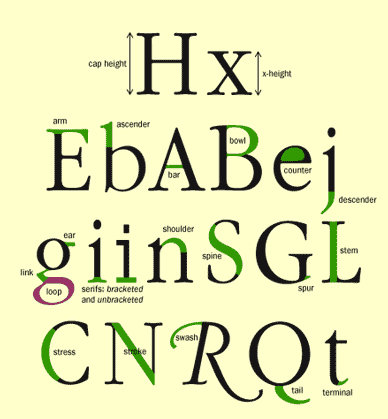
Anatomy
http://counterspace.motivo.com/
serifs: A serif is a little extra stroke found at the end of main vertical and horizontal strokes of some Letter forms.
san serif: The letters have no serifs
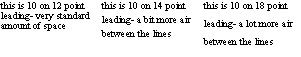
Leading (line spacing)
Spacing between letters
• Tracking or letterspacing applies to whole lines of text. Add or subract tracking to give text a looser or tighter feel. Letterspacing is not possible with HTML, but this example shows how letterspacing is done with CSS (Cascading Style Sheets). Letterspacing may be controlled in all graphics programs.
• Kerning applies to the space between individual letters. Certain combinations
of letters typically leave too much space between the characters, such as capital "A" and "W." These
examples have already been kerned, bringing the letters closer together:
Rules to live by:
1. Do not use every font you own in one document.
If you're a designer, it almost goes without saying that you own fonts. Lotsof fonts. Maybe even thousands of fonts.
When you start using many of those fonts in one document, the message gets lost in the jumble of fonts. That doesn't mean that you have to stick to the tried and true two fonts rule (one for headings and one for text), just make sure there's a reason why you're using the fonts you choose.
2. Serif type is easier to read than sans serif.
The theory goes that serif type is easier to read because the serifs draw your eye from character to character. Therefore, sans serif type is best left to headings and short amounts of text.
3. Do not put two spaces after a period.
4. Do not use all capital letters
People read by the shapes of words, not letter by letter.
That doesn't mean you can't ever use all capitals. Short phrases or headings can work well in all caps. Sans serif tends to work better in all caps than serif type; the serifs can actually detract from the readability of the text when set in all caps.
5. Do not center large amounts of text.
When you read, you rapidly scan one line, then your eye has to go from the right side of the page back to the left side of the page. When text is centered, it can be harder to find where the text begins again on the left side of the page, and actually all too easy to skip down lines of text
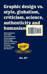
emigre
emigre.com
Emigre, Inc. is a digital type foundry, publisher and distributor of graphic design related software and printed materials based in Northern California. Founded in 1984, coinciding with the birth of the Macintosh, Emigre was one of the first independent type foundries to establish itself centered on personal computer technology. Emigre holds exclusive license to over 300 original typeface designs created by a roster of contemporary designers. Emigre's full line of typefaces, ornaments and illustrations is available in Type 1 PostScript and TrueType for both the Macintosh and PC.
ex.